It's been a while since I posted something on this blog that really had some substance. So today/tonight Im making up for it :)
I recently went on holiday to portugal which was fun.
Nothing to do with design but it does explain my lack of posts lately. While away my family and I were holidaying with another two families, so there was a total of 6 kids running around alot of the time. I mention this because after they realised I could draw, I began to work through their numerous and incredibly random requests. I wrote the strangest one's down.
- Zombie eating someone
- Man riding a giant bee, with guns
- A pixie fairy riding something/maybe an alien
- Man pooing
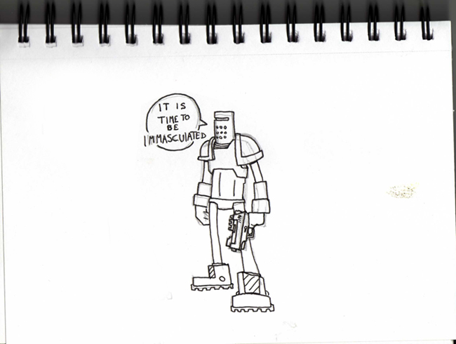
- An army butch man with combat shotgun and cigar, shooting evil man with blood saying "Eat Lead Sucker!"
- Man weeing
- Man pooing on someone who is throwing up while also being wee'd on
These kids were between 9-12. I blame southpark.
New work :)
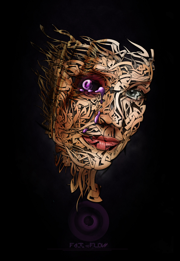
"FACE to FLOW"
I've been working on this for a while and i think i can call it finished. I've got annoyingly critical of my own work lately, so much so that i have started over working alot of pieces.
There's a couple of pieces I'm working on currently, not sure when or if i'll publish them. Im just trying to exdpand my portfolio to be honest.
There is a new Adamwitton.co.uk up and running. Although it's nothing amazing. Expect something better over the coming months.
Here are some cool fonts I found. The first is a funny bold typeface called MOO. The second is a slightly more serious hard edged font, very precise and looks kind of sci-fi ish , its called Amputa Bangiz , I actually used it in the piece above.
Time for some inspiration...
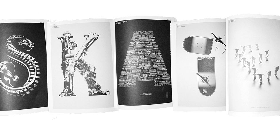
"SKATE con cinco letras"
This first piece was published in UNO magazine. Its the work of five artists and design teams, Álex Trochut, Inocuo The Sign, Angel Sanz & Jenny Chih Chieh Teng, Sergio Jiménez, Losieto studio. Each member designed a letter. I think it looks awesome, more about the piece here.
I am hoping this will replace the windows media players dated visualistations.
Below is a funny animation i found. Imagine the film "The Thing" but with toys :) Cool soundtrack too.
.
I am hoping this will replace the windows media players dated visualistations.
Below is a funny animation i found. Imagine the film "The Thing" but with toys :) Cool soundtrack too.
.
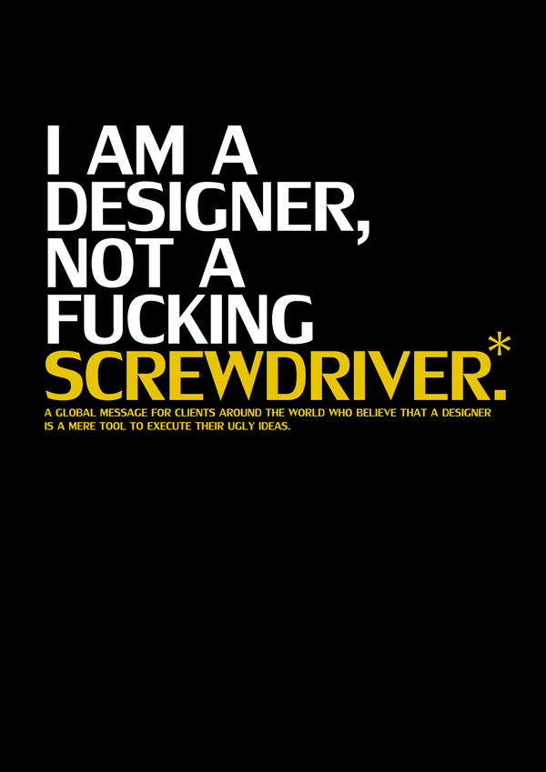
Well said Daniel Evanon
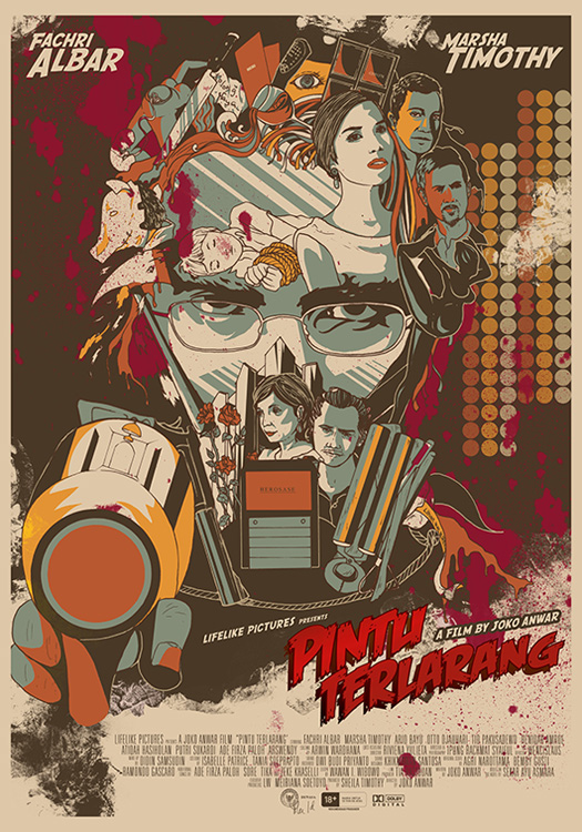 Poster designed by Mayumi Haryoto.
Below is the work of Olly Moss.


Cool stuff.
Time to sign out, Steven Seagal is on tv!!!




No comments:
Post a Comment